Archive for August 26th, 2007
Ooh La La! I think I’m in LOVE………..sneak peek!
Aug 26, 2007 Author: mytime | Filed under: CardsHere is another post with 2 designs using Sneak Peeks! I chose Ooh La La for this peek for you.
I love PARIS themed items. Jason and I went to Paris years ago, and it was simply gorgeous! We only had our photos developed for that trip-not on digital, which is a bummer cause they are just gorgeous, and they would fit my post here perfectly!
I love pink, gray, and black with white. Such a Froufrou color combo that fits this whimsical theme. My first sample has no pink, but the other one does.
Here is the first one
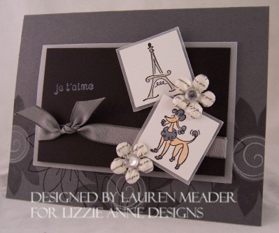 Je t’amie
Does anyone know what that means?
I dont! But it sounds pretty!
I used by Basic Gray by SU! I am head over heels in love with that gray color. LOVE IT!
I stamped the bottom of my card base with Daisy Dots. I used the gray ink for the solid flower, and then Brilliance graphite black for the out line flower images. That is my primary black ink these days. I love it because when used with myCopic markers , it doesn’t smudge. Its also great for my acrylic stamps since its a thicker pigment ink, I never get sloppy coverage. White craft ink was used for the swirly centers of the flowers.
I also switched to using ONLY Paper Trey Ink white cardstock. Its top quality, and takes ink like a dream. Its also WHITE! I mean really white. You put it next to SU! White and the results are shocking! Plus it feels thicker-yes its possible!
I layered my images with vellum cardstock. Sometimes you want the layer to be very subtle and not overpower the images. Since I have 2 small images as my main focus, I had to keep the attention there, rather than over power them with a high contrast layer. Make sense??
Again I slanted my images (Im so stuck on this for some reason) for interest.
I added some Prima’s from Isabelle’s Secret collection. They were really perfect. More adhesive rhinestones for the centers.
The gray taffeta ribbon is a gorgeous color, and tied this card off perfectly 😀 I colored the Eiffel Tower with a Sakura glitter pen. Perfect amount of sparkle.
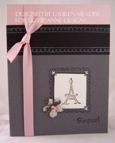 Bonjour!
OK I know what this one means! LOL!
I stamped the framed image twice. Once on the card base, and the other time on the white.
Trimmed out the frame, and stamped/colored my tower. <y white singlo gel pen added some color to the corners. Another Isabelle secrets prima (looks like lace) to the corner.
Bling on the flower and tower are sweet little touches.
This would be a great card for alot of goodbye reasons! New job, taking a trip (which you could make it a ticket holder!!!) moving-whatever. Sometimes goodbye cards need to be kept “LIGHT”. Meaning not all sad or serious.
It could even be I miss you for a friend or other person in your life.
Well thats it for today. Tomorrow I have more sneak peeks.
Check HERE for a MFT peek at what’s to come on the first! I will share a container I made for the promotion soon.
My Etsy

Who I Designed For
Blogroll
- Alicia
- Alli Miles
- Ally Blankenship
- Amber
- Andi @ crafts on a whim
- Angel R
- Angie Z
- Anne Kranitz
- Becky O
- Bee
- Beth Silaka
- Bethany Paull
- Beverly Nash
- Bobbie
- Cambria
- Cammie
- Card of the Week
- Card Positioning System (CPS)
- Cards for Cancer
- Catherine Doucette
- Charmaine
- Cheryl Sims
- Chriss Rollins
- Christina
- Christine Ewing
- Christine Wooden
- Colleen Schaan
- Craft Critique
- Craft Gossip
- Crystal
- Dawn Easton
- Emily Giovanni
- Geny
- Holly
- Igne Groot
- Inspirational Craft Blogs
- Irene
- Jami Sibley
- Jeanne Streiff
- Jen del Muro
- Jeni Bond
- JenMarie
- Jenn Balcer
- Jenn Diercks
- Jenn O
- Jennifer E
- Jennifer Mick
- Jennifer Pereda
- Jennifer-Sweet Treat
- Joanne Basile
- Jodi Collins
- Julia Stainton
- Julie Masse
- Karen
- Kathryn Berthiaume
- Katie Cotton
- Kelley Holland
- Kendra
- Kim Scholfield
- Kris’s Color Stripes! Get inspired here
- Kristen Dubosque
- Kristin Eberline
- Kristine
- Laura @ Sunshine Stamper
- Laura Turnmire
- Laurie Schmidlin
- Lesa Rapp
- Linda Duke
- Linda-LSN
- Lindsey Botkin
- Lisa (lakind scs)
- Lisa Kind
- Lori Craig
- Maggie
- Mara Campbell
- Maria
- Maria Levine
- Mary
- MaryJo
- Melanie M
- Monique Hansen
- Moxie Fab World
- Pam Imholz
- PaperCrafts Connection
- Peppers and Pollywogs Kids party site
- Rebecca Grohall
- Rita
- Robyn
- Rose Ann
- Sarah Vrolyk
- Sharon Harnist
- Sharon Johnson
- Sharon Rivera (a chemisrty with paper)
- Sherrie
- Sophia Landry
- Storage Units, Ink, & More Blog
- Sue Berker
- Susan (Rainy)
- Tangii Crane
- Tracy
- Tricia Traxler
- Trudee
- Velta
- VivLyn
- Zena
MTME Pretty Palette Color Team
MTME Pretty Patterns Sketch Team
My Time Made Easy TM LLC
Shop till you drop!
Lauren Meader
About Me
Copyrighted material
Subscribe To My Blog
Pages
- About me
- Alexa’s Story!
- My Crafty Corner!
- My Time Made Easy™ LLC
- Our Make A Wish Trip to Disney!
- Resume/Publication List
Calendar
Archives
- August 2013
- July 2013
- June 2013
- May 2013
- April 2013
- March 2013
- February 2013
- January 2013
- December 2012
- November 2012
- October 2012
- September 2012
- August 2012
- July 2012
- June 2012
- May 2012
- April 2012
- March 2012
- February 2012
- January 2012
- December 2011
- November 2011
- October 2011
- September 2011
- August 2011
- July 2011
- June 2011
- May 2011
- April 2011
- March 2011
- February 2011
- January 2011
- December 2010
- November 2010
- October 2010
- September 2010
- August 2010
- July 2010
- June 2010
- May 2010
- April 2010
- March 2010
- February 2010
- January 2010
- December 2009
- November 2009
- October 2009
- September 2009
- August 2009
- July 2009
- June 2009
- May 2009
- April 2009
- March 2009
- February 2009
- January 2009
- December 2008
- November 2008
- October 2008
- September 2008
- August 2008
- July 2008
- June 2008
- May 2008
- April 2008
- March 2008
- February 2008
- January 2008
- December 2007
- November 2007
- October 2007
- September 2007
- August 2007
- July 2007
- June 2007
- May 2007
- April 2007
- March 2007
- January 2007
Categories
- About Me
- All That Scraps
- blogger challenge
- camera/photo play
- Cards
- Contests
- family stuff
- FOR SALE
- Home decor/3-D items
- How to FAKE it!
- Introduction
- JUGS Challenge
- JustRite Stampers
- Lizzie Anne Designs
- My family stuff
- My Stamping Space
- My Time Made Easy
- My Time To Color Challenge
- My Time to Create Challenge
- My Timeless Template Challenge
- My Timeless Templates
- Mytime Mail
- MYTIME MOVIE/VIDEOs
- Papertrey Newsletter
- Pink Cat Studio
- Pretty Palette Challenge
- Pretty Patterns Sketch
- Product Opinions and Must haves
- Recipe's
- Saturday Sketch
- Smilebox Creations
- Stampavie
- Tutorials
- Uncategorized
- videos
Most Popular
- Create your own Onesie Card Tutorial-and important NOTE! PLEASE READ (2529)
- Saturday Sketch-Boxed bag holder (2333)
- Going GREEN! Fancy Flower Flourish-Closure Video (1478)
- Fabulous Favorite - Giveaway! (1336)
- a Prayer Request (1232)
- QUICK-Easter Baskets from Nestabilities-PTI style-and blog challenge (1063)
- Teaser Sketch (999)
- February Release Giveway! (and a little peek) (996)
- Group Post and Rambling Rose Video Tutorial (985)
- GIVEAWAY! Who wants it all?! (895)
Recent Comments (RSS)
- hedie: خرید راهبند
- 야동: Love to read it,Waiting For
- 야동: This seller is in a
- 바카라사이트: 여기 처음 왔어요. 나는이 게시판을
- 야동티비: I was surfing the Internet
- 바카라사이트: 비슷한 주제에 대한 흥미로운 정보를
- 바카라사이트: "여기에 제공해 주신 귀중한 정보와
- 온라인홀덤: 유익한 웹 사이트를 게시하는 데
- 홀덤나라: 나는 당신의 블로그를 정말 좋아합니다.
- lisa: Technology, too, has left an
Copyright © 2007 - My Time, My Creations, My Stampendence - is proudly powered by WordPress
This blog has been Tweaked and Designed by Sara Williams