Dare to get Dirty Friday Challenges!
Jul 27, 2007WOW !
Have I ever been busy. I have alot going on, that I soon will be able to share with you! Im stamping away, most of what is yet to be shared.
In just a few days, My Favorite Things will be releasing 4 sets!!! So maybe tomorrow Ill give you a view of some of the stuff I’ve been working on for that. They are all REALLY good so save your money. You will need it.
For now I think I will post the challenge cards I got done for Friday! I have been using SO MUCH soft sky and blue bayou, that I wanted to go with more bold colors. So I decided to break out the new colors.
Here is the one I did for Jami’s More is More
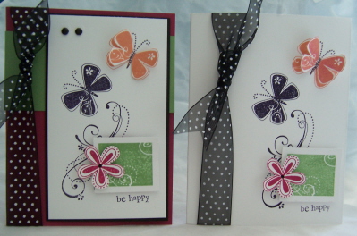 More and More Priceless
The one on the RIGHT was my original card.
The one on the left is the same, but MORE added. More color, layers and embellishments. I actually really like BOTH of them.
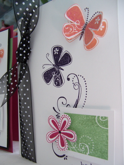
Here is a side view so you can see the dimension
 I had so much fun with this set, that I then created ……….
this card
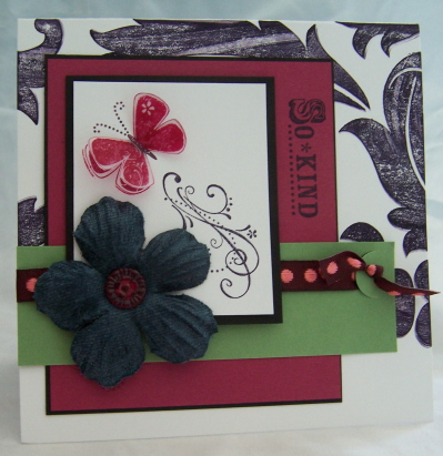 Priceless inspiration
This one was definitely inspired by my More is More. Im in love with Baroque bkgd. I find that funny cause I rarely use ANY of my bkgds anymore! No Idea why. Maybe Im enjoying a cleaner style? Who knows, my taste and trends seem to change month by month.
NOW for the DIRTY DETAILS- I used Paper Trey White cardstock, then Pomegranate, Wasabi, and Black (ink and cardstock) for all three cards. Stamp sets is Pricless by SU! I LOVE this set. I also used So Many Sayings, and Baroque bkgd. The large velvet flower is by Bazzill.
ALL my cards have a 3D element to them. I love making something POP off the card.
Now for my next challenge Transparencies
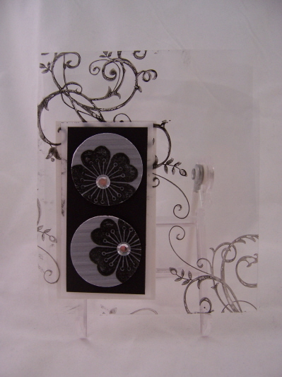 Talk about having a hard time getting a photo! GEESH!
I got this beautiful flower image from Impress. I loved using just a portion of it! I stamped the flower in brilliance black ink on vellum cardstock-let dry, then crimped it. Popped out the circles and added some much needed BLING.
Using black StazOn I stamped by Barouque Motifs image in my acetate layer. I thought it was pretty cool looking.
Well thats it for now. I made a ton of cards today, and did a tutorial! Not to be shown here-yet! So Im totally wiped out.
Im going to relax with a Vanilla Bean and Kahula drink, and let Jason put the kids to bed.
I hope you get to try the challenges this week/weekend
Check in tomorrow I have my sketch challenge ready to go!!!!!!!!!!! If you havent stopped by in a few days there is a ton of new stuff uploaded here-so read on!

My Etsy

Who I Designed For
Blogroll
- Alicia
- Alli Miles
- Ally Blankenship
- Amber
- Andi @ crafts on a whim
- Angel R
- Angie Z
- Anne Kranitz
- Becky O
- Bee
- Beth Silaka
- Bethany Paull
- Beverly Nash
- Bobbie
- Cambria
- Cammie
- Card of the Week
- Card Positioning System (CPS)
- Cards for Cancer
- Catherine Doucette
- Charmaine
- Cheryl Sims
- Chriss Rollins
- Christina
- Christine Ewing
- Christine Wooden
- Colleen Schaan
- Craft Critique
- Craft Gossip
- Crystal
- Dawn Easton
- Emily Giovanni
- Geny
- Holly
- Igne Groot
- Inspirational Craft Blogs
- Irene
- Jami Sibley
- Jeanne Streiff
- Jen del Muro
- Jeni Bond
- JenMarie
- Jenn Balcer
- Jenn Diercks
- Jenn O
- Jennifer E
- Jennifer Mick
- Jennifer Pereda
- Jennifer-Sweet Treat
- Joanne Basile
- Jodi Collins
- Julia Stainton
- Julie Masse
- Karen
- Kathryn Berthiaume
- Katie Cotton
- Kelley Holland
- Kendra
- Kim Scholfield
- Kris’s Color Stripes! Get inspired here
- Kristen Dubosque
- Kristin Eberline
- Kristine
- Laura @ Sunshine Stamper
- Laura Turnmire
- Laurie Schmidlin
- Lesa Rapp
- Linda Duke
- Linda-LSN
- Lindsey Botkin
- Lisa (lakind scs)
- Lisa Kind
- Lori Craig
- Maggie
- Mara Campbell
- Maria
- Maria Levine
- Mary
- MaryJo
- Melanie M
- Monique Hansen
- Moxie Fab World
- Pam Imholz
- PaperCrafts Connection
- Peppers and Pollywogs Kids party site
- Rebecca Grohall
- Rita
- Robyn
- Rose Ann
- Sarah Vrolyk
- Sharon Harnist
- Sharon Johnson
- Sharon Rivera (a chemisrty with paper)
- Sherrie
- Sophia Landry
- Storage Units, Ink, & More Blog
- Sue Berker
- Susan (Rainy)
- Tangii Crane
- Tracy
- Tricia Traxler
- Trudee
- Velta
- VivLyn
- Zena
MTME Pretty Palette Color Team
MTME Pretty Patterns Sketch Team
My Time Made Easy TM LLC
Shop till you drop!
Lauren Meader
About Me
Copyrighted material
Subscribe To My Blog
Pages
- About me
- Alexa’s Story!
- My Crafty Corner!
- My Time Made Easy™ LLC
- Our Make A Wish Trip to Disney!
- Resume/Publication List
Calendar
Archives
- August 2013
- July 2013
- June 2013
- May 2013
- April 2013
- March 2013
- February 2013
- January 2013
- December 2012
- November 2012
- October 2012
- September 2012
- August 2012
- July 2012
- June 2012
- May 2012
- April 2012
- March 2012
- February 2012
- January 2012
- December 2011
- November 2011
- October 2011
- September 2011
- August 2011
- July 2011
- June 2011
- May 2011
- April 2011
- March 2011
- February 2011
- January 2011
- December 2010
- November 2010
- October 2010
- September 2010
- August 2010
- July 2010
- June 2010
- May 2010
- April 2010
- March 2010
- February 2010
- January 2010
- December 2009
- November 2009
- October 2009
- September 2009
- August 2009
- July 2009
- June 2009
- May 2009
- April 2009
- March 2009
- February 2009
- January 2009
- December 2008
- November 2008
- October 2008
- September 2008
- August 2008
- July 2008
- June 2008
- May 2008
- April 2008
- March 2008
- February 2008
- January 2008
- December 2007
- November 2007
- October 2007
- September 2007
- August 2007
- July 2007
- June 2007
- May 2007
- April 2007
- March 2007
- January 2007
Categories
- About Me
- All That Scraps
- blogger challenge
- camera/photo play
- Cards
- Contests
- family stuff
- FOR SALE
- Home decor/3-D items
- How to FAKE it!
- Introduction
- JUGS Challenge
- JustRite Stampers
- Lizzie Anne Designs
- My family stuff
- My Stamping Space
- My Time Made Easy
- My Time To Color Challenge
- My Time to Create Challenge
- My Timeless Template Challenge
- My Timeless Templates
- Mytime Mail
- MYTIME MOVIE/VIDEOs
- Papertrey Newsletter
- Pink Cat Studio
- Pretty Palette Challenge
- Pretty Patterns Sketch
- Product Opinions and Must haves
- Recipe's
- Saturday Sketch
- Smilebox Creations
- Stampavie
- Tutorials
- Uncategorized
- videos
Most Popular
- Create your own Onesie Card Tutorial-and important NOTE! PLEASE READ (2529)
- Saturday Sketch-Boxed bag holder (2333)
- Going GREEN! Fancy Flower Flourish-Closure Video (1478)
- Fabulous Favorite - Giveaway! (1336)
- a Prayer Request (1232)
- QUICK-Easter Baskets from Nestabilities-PTI style-and blog challenge (1063)
- Teaser Sketch (999)
- February Release Giveway! (and a little peek) (996)
- Group Post and Rambling Rose Video Tutorial (985)
- GIVEAWAY! Who wants it all?! (895)
Recent Comments (RSS)
- 첫충사이트: 완전히 흥미로운 블로그 게시입니다. 저는
- sarah: Wow, Lauren, what a stunning
- hedie: خرید راهبند
- 야동: Love to read it,Waiting For
- 야동: This seller is in a
- 바카라사이트: 여기 처음 왔어요. 나는이 게시판을
- 야동티비: I was surfing the Internet
- 바카라사이트: 비슷한 주제에 대한 흥미로운 정보를
- 바카라사이트: "여기에 제공해 주신 귀중한 정보와
- 온라인홀덤: 유익한 웹 사이트를 게시하는 데
Copyright © 2007 - My Time, My Creations, My Stampendence - is proudly powered by WordPress
This blog has been Tweaked and Designed by Sara Williams
10 Responses for "Dare to get Dirty Friday Challenges!"
I have done a lot of transparencies cards and I just love them! They’re so unique. Beautiful cards!
I love your transparency card… got to ask where you can get transparency every since SU stopped having them my supply is getting low and I want some comparable to SU. Do you by chance know where I might find some…
I get my transparencies at Walmart! Like 10 better quality sheets for $4.99!!!
Geez, Lauren!
I can hardly keep up with your blog! Awesome cards!
Lauren — awesome cards! I have a quick question, because I, too, love dimensional cards. My question is — how well do they mail? I haven’t dared put one in an envelope and mail one, yet, and I so want to. I am assuming extra postage, but what is your experience? or others’ on this? Thanks!
Julie GREAT Question
Square cards are always more-
and if its a card with minimal dimension no problem. My cards in this post would be normal postage.
When you add weighted things like Hodgepodge hardhare and stuff it increases the thickness and weight of the card as well.
I will usually place a thin bubble wrap layer over them if being mailed and yes that is a little extra. But it protects the design and for it to arrive intact is pricless!!!
I also note fragile on the envelope. Not that they ever seem to care.
Thanks for the response. When I do a square card, I have been opting to do them in 4.25×4.25 and then using double sided tape on one side of an A2 envie to create a square pocket in the envelope… sometimes I punch a “window” using a small punch in that area, and even put in ds paper or vellum for a cool effect.
Sounds like a bigger card would warrant the extra postage, though, and a bigger envelope to pad it… your cards just Rock, and I am moving more and more into the bigger is better realm, saving the 3×3 cards for enclosures, and the 4.25×4.25 for the simpler cards…
Designing square is very cool… I am liking that they sort of work their way up into things for a 6×6 album page ;^)*
‘Preciate all you are doing here… You inspire me to all ends!
[…] loved all the bright colors. This flower is the same one I used for my Acetate sample, in another post. Its from Impress. I believe Savyy makes it. I had this ribbon by Fancy Pants and […]
Its my great pleasure to visit your blog and to enjoy your awesome posts here. I like that a lot. I know that you put much attention for these articles, as all of them make sense and are very useful
Good article makes constant progress, thank you share, the accumulation of knowledge is to keep learning, attention is the beginning of wealth
Leave a reply