Masculine my way
Mar 21, 2007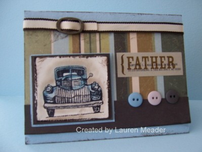
OK I’m sure I’m not the only one who finds guy cards difficult. But I have to say I liked this one alot. Will I give it to “my” dad, NO! LOL! But I still love it.
A girl on SCS and I switched images (sorry I forget who!) and she was sweet to send me several of this image in vanilla and white. Its Classic pick ups by Stampin up! You may not see that the image is filled in with pearlescent pastels. I like the rustic, vinatage-y (yeah I know its not a word but I like it) feel. I LOVE my Prism paper! Its got a soft textured side which was perfect for this card. Plus it matched my ribbon and PP. I love combining my goodies from different companies. What do you think? Should I buy this set?
Let me know what masculine sets you love, and feel free to enable me with a link. This is my toughest area of creativity!
Prisim cardstock- in Nautical blue light (www.prisimpaper.com)
Patterned paper -well worn bkgd by Marcella by K (target)
Tim Holtz distressing ink in tea.
father sticker by- 7 gypsies (starlitstudio ebay store)
ribbon from Jody’s ribbon share
buttons by SEI- grandmas attic
HPH in gold
Pearlescent pastels
glitter pen by Sakura (starlitstudio ebay store)
edge distressor by SU!

My Etsy

Who I Designed For
Blogroll
- Alicia
- Alli Miles
- Ally Blankenship
- Amber
- Andi @ crafts on a whim
- Angel R
- Angie Z
- Anne Kranitz
- Becky O
- Bee
- Beth Silaka
- Bethany Paull
- Beverly Nash
- Bobbie
- Cambria
- Cammie
- Card of the Week
- Card Positioning System (CPS)
- Cards for Cancer
- Catherine Doucette
- Charmaine
- Cheryl Sims
- Chriss Rollins
- Christina
- Christine Ewing
- Christine Wooden
- Colleen Schaan
- Craft Critique
- Craft Gossip
- Crystal
- Dawn Easton
- Emily Giovanni
- Geny
- Holly
- Igne Groot
- Inspirational Craft Blogs
- Irene
- Jami Sibley
- Jeanne Streiff
- Jen del Muro
- Jeni Bond
- JenMarie
- Jenn Balcer
- Jenn Diercks
- Jenn O
- Jennifer E
- Jennifer Mick
- Jennifer Pereda
- Jennifer-Sweet Treat
- Joanne Basile
- Jodi Collins
- Julia Stainton
- Julie Masse
- Karen
- Kathryn Berthiaume
- Katie Cotton
- Kelley Holland
- Kendra
- Kim Scholfield
- Kris’s Color Stripes! Get inspired here
- Kristen Dubosque
- Kristin Eberline
- Kristine
- Laura @ Sunshine Stamper
- Laura Turnmire
- Laurie Schmidlin
- Lesa Rapp
- Linda Duke
- Linda-LSN
- Lindsey Botkin
- Lisa (lakind scs)
- Lisa Kind
- Lori Craig
- Maggie
- Mara Campbell
- Maria
- Maria Levine
- Mary
- MaryJo
- Melanie M
- Monique Hansen
- Moxie Fab World
- Pam Imholz
- PaperCrafts Connection
- Peppers and Pollywogs Kids party site
- Rebecca Grohall
- Rita
- Robyn
- Rose Ann
- Sarah Vrolyk
- Sharon Harnist
- Sharon Johnson
- Sharon Rivera (a chemisrty with paper)
- Sherrie
- Sophia Landry
- Storage Units, Ink, & More Blog
- Sue Berker
- Susan (Rainy)
- Tangii Crane
- Tracy
- Tricia Traxler
- Trudee
- Velta
- VivLyn
- Zena
MTME Pretty Palette Color Team
MTME Pretty Patterns Sketch Team
My Time Made Easy TM LLC
Shop till you drop!
Lauren Meader
About Me
Copyrighted material
Subscribe To My Blog
Pages
- About me
- Alexa’s Story!
- My Crafty Corner!
- My Time Made Easy™ LLC
- Our Make A Wish Trip to Disney!
- Resume/Publication List
Calendar
Archives
- August 2013
- July 2013
- June 2013
- May 2013
- April 2013
- March 2013
- February 2013
- January 2013
- December 2012
- November 2012
- October 2012
- September 2012
- August 2012
- July 2012
- June 2012
- May 2012
- April 2012
- March 2012
- February 2012
- January 2012
- December 2011
- November 2011
- October 2011
- September 2011
- August 2011
- July 2011
- June 2011
- May 2011
- April 2011
- March 2011
- February 2011
- January 2011
- December 2010
- November 2010
- October 2010
- September 2010
- August 2010
- July 2010
- June 2010
- May 2010
- April 2010
- March 2010
- February 2010
- January 2010
- December 2009
- November 2009
- October 2009
- September 2009
- August 2009
- July 2009
- June 2009
- May 2009
- April 2009
- March 2009
- February 2009
- January 2009
- December 2008
- November 2008
- October 2008
- September 2008
- August 2008
- July 2008
- June 2008
- May 2008
- April 2008
- March 2008
- February 2008
- January 2008
- December 2007
- November 2007
- October 2007
- September 2007
- August 2007
- July 2007
- June 2007
- May 2007
- April 2007
- March 2007
- January 2007
Categories
- About Me
- All That Scraps
- blogger challenge
- camera/photo play
- Cards
- Contests
- family stuff
- FOR SALE
- Home decor/3-D items
- How to FAKE it!
- Introduction
- JUGS Challenge
- JustRite Stampers
- Lizzie Anne Designs
- My family stuff
- My Stamping Space
- My Time Made Easy
- My Time To Color Challenge
- My Time to Create Challenge
- My Timeless Template Challenge
- My Timeless Templates
- Mytime Mail
- MYTIME MOVIE/VIDEOs
- Papertrey Newsletter
- Pink Cat Studio
- Pretty Palette Challenge
- Pretty Patterns Sketch
- Product Opinions and Must haves
- Recipe's
- Saturday Sketch
- Smilebox Creations
- Stampavie
- Tutorials
- Uncategorized
- videos
Most Popular
- Create your own Onesie Card Tutorial-and important NOTE! PLEASE READ (2529)
- Saturday Sketch-Boxed bag holder (2333)
- Going GREEN! Fancy Flower Flourish-Closure Video (1478)
- Fabulous Favorite - Giveaway! (1336)
- a Prayer Request (1232)
- QUICK-Easter Baskets from Nestabilities-PTI style-and blog challenge (1063)
- Teaser Sketch (999)
- February Release Giveway! (and a little peek) (996)
- Group Post and Rambling Rose Video Tutorial (985)
- GIVEAWAY! Who wants it all?! (895)
Recent Comments (RSS)
- 첫충사이트: 완전히 흥미로운 블로그 게시입니다. 저는
- sarah: Wow, Lauren, what a stunning
- hedie: خرید راهبند
- 야동: Love to read it,Waiting For
- 야동: This seller is in a
- 바카라사이트: 여기 처음 왔어요. 나는이 게시판을
- 야동티비: I was surfing the Internet
- 바카라사이트: 비슷한 주제에 대한 흥미로운 정보를
- 바카라사이트: "여기에 제공해 주신 귀중한 정보와
- 온라인홀덤: 유익한 웹 사이트를 게시하는 데
Copyright © 2007 - My Time, My Creations, My Stampendence - is proudly powered by WordPress
This blog has been Tweaked and Designed by Sara Williams
6 Responses for "Masculine my way"
Awesome, masculine card!
New to shoes – Got these for my husband who has Reynaud’s and needs warm shoes, even in the house. He loves them. He takes off his work shoes and goes right into these. They look great on him and they’re super light weight – great for tired feet.
Very great job. 🙂 Thank you!
Bon article devrait être utilisé pour partager de vous, de laisser plus de gens le savent, si cela fait sens. Je
pense que vous écrivez bien, et nous espérons être en mesure de voir plus de vous faire partager.
La vie est toujours heureux, et pas seulement être en mesure de connaître ses propres expériences de vie,
peuvent aussi se sentir de la part d’autres, si elle est bonne ou mauvaise, je pense que cela est très bon, les
meilleurs articles originaux.
wholesale underwears, Cheap CK underwears, Cheap sexy lingerie
Leave a reply